

According to the Baymard Institute, the average cart abandonment rate in e-commerce is approximately 70.19%. Nearly seven out of ten shoppers who add something to cart never finish the purchase. That should change how growth is approached. Before spending more on ads, email, or affiliates, fix the point where high-intent buyers already say yes, then leave anyway.
Good e-commerce checkout optimization isn't just a UX exercise. It sits at the intersection of form design, mobile usability, payment acceptance, trust, support load, and how your business gets paid after the customer checks out. A checkout can look clean and still perform badly if the payment mix is wrong for the market, if taxes appear too late, or if settlement creates unnecessary operational drag.
Table of Contents
- Why Your Checkout Is Leaking Revenue
- Reduce effort before you redesign anything
- Make the final step feel safe and obvious
- More payment choice helps, but only when it is relevant
- Settlement design matters as much as checkout design
- Subscription checkout needs different decisions
- Community businesses need payment and access in one flow
Why Your Checkout Is Leaking Revenue
A large share of checkout starts still end without a completed order. The costly part is not the percentage itself. It is how much of that loss comes from preventable friction inside the final few minutes of the buying process.
Checkout traffic is high intent traffic. These shoppers already found the product, accepted the price closely enough to continue, and decided the purchase was worth their time. If they drop at this stage, the problem is usually execution. Common causes include unclear totals, unnecessary form fields, payment options that do not match the buyer's market, or a flow that creates doubt right before the charge.
Treat checkout as a revenue recovery system.
That changes how teams prioritize work. Cosmetic updates can help, but they rarely fix the biggest leaks on their own. A cleaner button style does not solve a failed authorization rate in a key market. A shorter form does not solve slow cross-border payouts, messy reconciliation, or subscription renewals that break because the payment setup was fragile from the start.
The stronger approach is to audit checkout on three levels at once:
- Conversion friction: Where buyers hesitate, back out, or hit avoidable errors
- Payment fit: Whether card acceptance, local preferences, and approval flows match the customer's location and device
- Cash flow operations: How quickly funds settle, how predictable reporting is, and whether recurring charges are built for subscriptions, memberships, or community access
This is also where many international brands leave money on the table. They focus on front-end UX and ignore the economics behind the payment flow. If a business sells globally, then checkout performance includes authorization rates, currency clarity, fraud controls, payout timing, and settlement design. For some teams, global card acceptance paired with predictable USDC settlement is not a finance-side detail. It is a practical way to reduce payout delays, simplify treasury movement, and keep cross-border revenue easier to forecast.
I also look at whether the checkout can support the next transaction, not just the first one. One-click returning buyer flows, saved payment credentials, subscription consent, and access provisioning all affect lifetime value. A checkout that converts the first sale but creates churn, failed renewals, or support overhead is still leaking revenue. Teams evaluating one-click payment flows for repeat purchases should measure speed against chargeback risk, consent requirements, and recurring billing reliability.
The right question is simple. Where does the buyer lose confidence, and where does the business lose control of payment performance after the order is placed?
The Foundations of a High-Converting Checkout UX
A high-converting checkout feels easy before the customer has typed much at all. That's the standard to aim for.
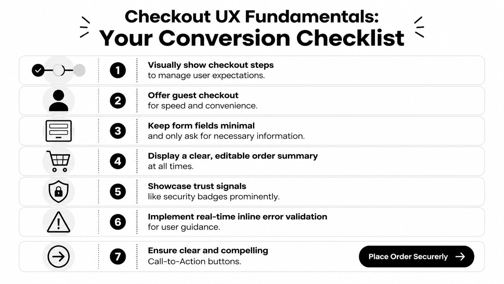
Reduce effort before you redesign anything
Start with the basics. A surprising number of checkouts still ask for information that doesn't help fulfill the order or approve the payment. Every extra field creates one more chance for hesitation, error, or abandonment.
The most reliable fixes are usually unglamorous:
- Offer guest checkout first: If someone wants the product, don't make account creation the toll gate.
- Remove non-essential fields: Keep only what's needed for payment, delivery, and compliance.
- Use address autofill: It cuts typing and reduces avoidable mistakes.
- Validate inline: Show the problem next to the field, not after a full-page failure.
- Keep the order summary visible: Buyers should never lose sight of what they're buying and what they'll pay.
Single-page checkout often works well for straightforward consumer purchases because it reduces uncertainty. Multi-step can still be the better choice when shipping logic, B2B billing, or review requirements are more complex. The mistake isn't choosing one model over the other. The mistake is making the flow feel non-linear or hard to recover from when the user needs to edit something.
One practical pattern that works well is to keep the structure visibly linear even if the page is technically dynamic. A customer should always know three things: where they are, what comes next, and whether their entered data is safe.
For faster repeat purchases, teams often pair this with express paths. A good example is a one-click payment flow for buyers who don't need to re-enter the same information every time. That won't replace a well-built standard checkout, but it can reduce friction for returning users and simple purchase scenarios.
A checkout doesn't need to feel short because it has fewer pixels. It needs to feel short because the buyer isn't doing unnecessary work.
Make the final step feel safe and obvious
Many teams focus heavily on form structure and then under-design the final commitment moment. That's where hesitation spikes.
The primary button should say exactly what happens next. "Pay now" or "Complete purchase" is better than vague language. If the customer is about to leave the site for an external payment step, say so. If they're placing a subscription order, make the recurring nature clear before the click.
A strong final payment section usually includes:
| Element | What good looks like | What fails |
|---|---|---|
| CTA copy | Specific action label | Generic "Continue" |
| Error handling | Inline, persistent, easy to fix | Full-page error after submit |
| Order summary | Editable and always accessible | Hidden until review |
| Billing clarity | Totals are consistent | Extra costs appear late |
This part of e-commerce checkout optimization is rarely about persuasion copy. It is mostly about removing ambiguity. When users understand the action, trust the page, and can correct mistakes without starting over, completion rates usually improve for a simple reason. The path feels controlled.
Optimizing for Mobile and Global Customers
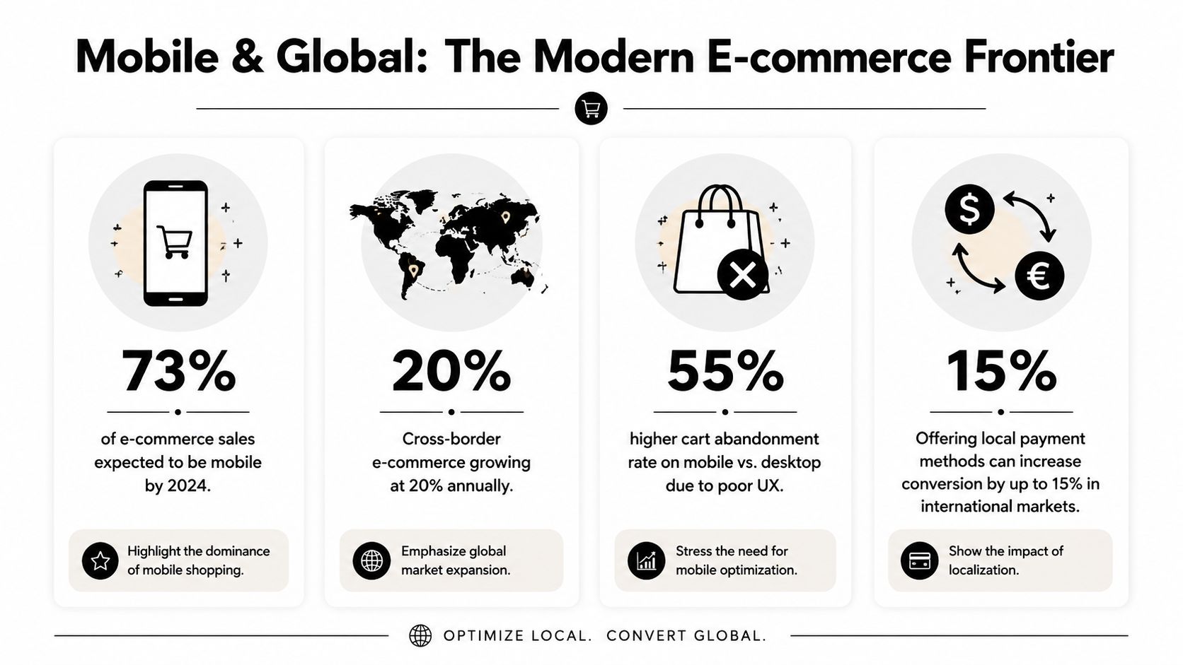
Mobile now drives the majority of online shopping activity, and that changes how checkout should be built. Teams that still review checkout on desktop first usually miss the frictions that suppress conversion on phones and in cross-border orders.
Mobile-first is no longer optional
Mobile commerce has surged to represent approximately 73% of total e-commerce sales globally, according to Stripe's guide to e-commerce checkout best practices. A checkout that only "works" on mobile is still underperforming. The bar is higher. It needs to be fast to complete one-handed, readable without zooming, and forgiving when the buyer gets interrupted.
The common failure points are practical, not mysterious. Fields are too tight. Card, phone, and ZIP inputs trigger the wrong keyboard. Address forms ask for too much too early. The order summary takes over the screen. Redirect-based payment steps make buyers feel like they left the purchase flow.
The fixes are straightforward:
- Use larger tap targets: Buttons, radio options, and checkboxes need enough spacing for thumbs.
- Set the right input mode: Numeric and email fields should call the correct keyboard on iOS and Android.
- Keep the primary action visible: Sticky confirmation areas often improve completion on longer mobile checkouts.
- Collapse non-essential fields: Apartment numbers, company names, and secondary address lines should stay optional and unobtrusive.
- Offer mobile wallets where they reduce typing: They help most on repeat purchases and lower-consideration orders.
Mobile optimization also affects payment expansion. If you're reviewing market coverage, this guide to choosing the best international payment gateway is a useful reference for comparing local method support, settlement options, and cross-border fit.
A quick visual walkthrough helps when teams are aligning on mobile priorities:
Global checkout breaks when localization stops at translation
Translating the checkout page is not enough. Buyers judge whether a checkout feels local by the currency, card acceptance, payment methods, taxes, address logic, and payout reliability behind the page.
A shopper in the Netherlands may expect iDEAL. A buyer in Belgium may look for Bancontact. In many markets, cards still matter most, but local preferences often decide whether a buyer completes the order or abandons it. That matters even more on mobile, where patience is low and trust has to be earned quickly.
The operational side matters too. Cross-border checkout is not only a UX question. It is a payments and finance question. Merchants need broad card acceptance, local methods where demand justifies the complexity, and settlement they can forecast. For some businesses, especially subscription products, memberships, and paid communities, global card payments with USDC settlement can reduce payout delays and make cash flow easier to plan across markets.
That trade-off is worth evaluating carefully. More payment methods can lift conversion, but every added method increases reconciliation work, support edge cases, and failure scenarios. The right stack usually covers the payment habits of your top markets first, then adds options based on measured demand rather than a long checkbox list.
Test those flows in the target country on real devices. A payment method that converts well on desktop in one market can produce avoidable drop-off on mobile in another. The stores that handle global checkout well usually do three things consistently: localize the payment experience, keep settlement predictable, and optimize the flow for repeat revenue, not only the first order.
Building Trust and Ensuring Security
Trust isn't branding fluff at checkout. It's a conversion requirement.
Baymard's abandonment findings tie a large share of drop-off to late cost revelation and avoidable friction in the flow. In real checkouts, users don't experience these as separate UX issues. They experience them as doubt. "Why did the total change?" "Why do I need this field?" "Is this payment page legitimate?" The design has to answer those questions before the buyer asks them.
Trust signals have to appear at the point of doubt
Security badges in the footer don't do much. Buyers need reassurance where the anxiety surfaces, which is usually near payment entry, order review, and any off-site redirect.
Useful trust elements include:
- Recognizable card marks: Show accepted card brands near the payment area.
- Transparent policies: Keep returns, refunds, and support access visible.
- Clear business identity: Contact details and legal business information matter.
- Stable totals: Product page, cart, and checkout should agree on the price structure.
One of the most common mistakes is treating shipping, tax, and fees as a reveal at the end. Buyers read that as bait-and-switch, even when the amounts are legitimate. If you're tightening security and payment handling internally, it's worth reviewing the practical side of PCI compliance requirements so the trust layer matches the underlying process.
Security design reduces support and failed orders
A secure checkout should also be easy to understand. Strong Customer Authentication, card verification steps, and issuer prompts are normal parts of modern commerce, but they need context. If the buyer gets challenged and the interface offers no explanation, some will assume the payment failed or the site is broken.
Good security UX usually has these traits:
| Area | Better approach |
|---|---|
| Authentication step | Explain that additional verification may be required |
| Redirects | Label external steps clearly before they happen |
| Error recovery | Preserve entered data wherever possible |
| Support path | Offer immediate help for stuck buyers |
The safest-looking checkout is often the one that explains the process clearly, not the one with the most icons.
This matters after conversion too. Confusing payment flows create duplicate orders, support tickets, and refund requests. Secure design should lower anxiety for the customer and cleanup work for the merchant.
Expanding Payment Options and Streamlining Payouts
Checkout revenue often gets lost after the buyer clicks pay. Approval rates, local payment fit, payout timing, currency exposure, and reconciliation rules all shape whether a sale turns into usable cash.
More payment choice helps, but only when it is relevant
Adding methods blindly creates clutter. The better approach is to choose the payment mix each market expects, then present those options in a way that keeps the decision easy.
For a domestic store, cards may cover enough demand. For a cross-border store, that usually falls short. Buyers in different countries have different habits, and checkout friction rises fast when the available methods feel unfamiliar. As noted earlier, local payment preferences in Europe are a clear example. Broad, US-centered checkout advice often misses that.
A useful payment review usually answers four operational questions:
- Which payment methods are trusted in each target market
- Which methods support the order values and product types you sell
- How each method behaves after authorization, including redirects, holds, and delayed confirmation
- How the payment result flows into fulfillment, accounting, and customer support
That last point gets ignored too often. A payment method that adds a few points of conversion but creates manual reconciliation work, delayed shipment release, or refund complexity can hurt margin.
Stores in regulated categories have even less room for error. Product type, geography, and processor rules can limit what you can accept and how you can settle funds. If that applies to your business, this guide to mastering regulated product payments smoothly is worth reading because it focuses on restrictions that standard UX advice rarely covers.
Settlement design matters as much as checkout design
A checkout can perform well on the surface and still create finance problems every week. I see this in global stores that accept payments successfully, then deal with fragmented processors, slow payouts, foreign exchange losses, and unclear settlement windows.
The cleaner setup is often to separate customer payment choice from business settlement preference. Customers can pay with familiar methods such as cards, while the merchant receives USDC. That gives the buyer a standard checkout experience and gives the business more predictable digital-dollar settlement.
Suby is one example of that model. It provides an API for accepting card and crypto payments while settling merchants in USDC. It also supports paylinks, embedded checkout, recurring payments, and Discord and Telegram integrations for subscription businesses, paid communities, and access-based products.
This matters more if your revenue is recurring. Subscription brands and community operators need more than a one-time payment form. They need stable renewals, clear entitlement logic, consistent payout handling, and fewer exceptions when customers are spread across countries and payment methods.
The trade-off is straightforward. More payment options can raise acceptance. Every added option also changes operations, support workload, and cash flow. Strong checkout optimization covers both sides at once. The front end should help the customer pay. The payout layer should help the business recognize, settle, and reuse revenue without unnecessary friction.
Implementing and Testing Your Optimized Checkout
Most checkout improvements fail because teams change too much at once. They redesign the layout, alter payment order, edit copy, and add new methods in a single release. If conversion moves, nobody knows why.
Choose the right integration path
Your integration method shapes what you can test, how fast you can launch, and how much control your team has over the checkout experience.
Here is a simple perspective:
| Method | Best For | Effort |
|---|---|---|
| API | Businesses that need full control over checkout logic, UX, and backend events | High |
| Embedded checkout | Teams that want a pre-built flow inside their site | Medium |
| Paylink | Fast launches, invoices, social selling, support-driven sales, and lightweight funnels | Low |
The wrong choice creates unnecessary work. I usually recommend API only when the business needs custom logic, custom states, or deep product-specific behavior. If the primary goal is to launch quickly with a reliable payment step, an embedded flow or paylink is often the smarter move.
Test with discipline, not guesses
A sound workflow starts with instrumentation. A practical checkout-optimization workflow starts by instrumenting a funnel from product view to purchase completion, then using A/B tests on one variable at a time to avoid confounding effects and isolate the impact of changes, as outlined in this checkout optimization workflow guide.
That means tracking the full sequence, not just final conversion. At minimum, watch:
- Cart add to checkout start: Tells you whether cart design or pre-checkout friction is the issue.
- Checkout start to payment selection: Shows whether the form is too heavy.
- Payment selection to purchase completion: Often reveals trust or payment-method problems.
- Device-level differences: Mobile and desktop usually fail for different reasons.
- Support-contact patterns: Repeated questions often identify hidden friction faster than analytics alone.
A few testing habits matter more than teams expect:
- Change one variable at a time. If you test a new layout and a new payment order together, you lose the learning.
- Pair analytics with qualitative review. Funnel numbers tell you where people leave. Session review and user feedback tell you why.
- Review checkout daily during active tests. Payment issues and validation bugs don't wait for weekly reporting.
Small checkout tests beat large redesigns because they produce usable evidence, not just opinions.
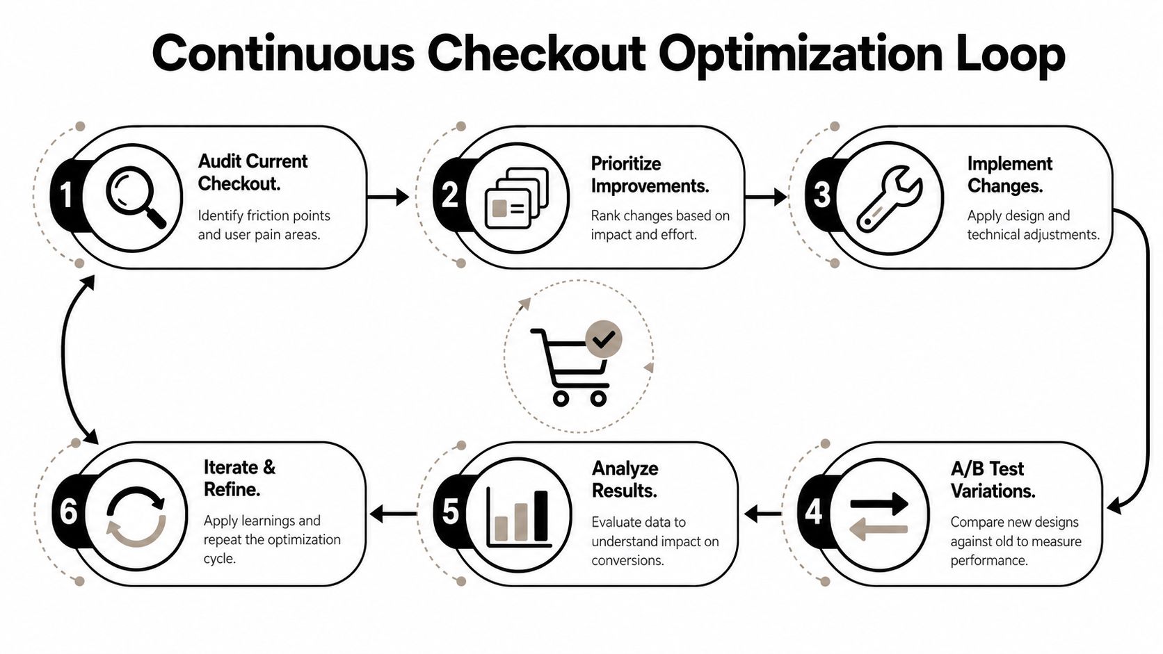
The best teams build a loop. Audit. Prioritize. Implement. Test. Review. Repeat. That rhythm is what turns e-commerce checkout optimization from a one-time project into a compounding advantage.
Beyond the First Purchase Subscription and Community Flows
Many checkout strategies optimize for the first sale and stop there. That's too narrow for subscription businesses, membership products, and community-led offers.
Recent UX guidance points out that most content focuses on the first conversion, but rarely answers how to optimize checkout for subscriptions or lifecycle events. It also suggests that checkout is moving toward a more state-aware model rather than a single final payment page, as discussed in Ping Identity's checkout optimization article. That shift matters because recurring revenue businesses don't just need a buyer to convert once. They need the payment flow to support retention, upgrades, renewals, and support resolution.
Subscription checkout needs different decisions
Subscription checkout should reduce surprise, not just reduce clicks.
The basics are different from one-time retail:
- Recurring terms must be obvious: Billing frequency, renewal timing, and cancellation terms should be visible before payment.
- Plan selection needs context: Users should understand what changes between tiers.
- Saved state matters: If someone leaves, they should be able to return without starting over.
- Support access matters more: Subscription buyers often have plan questions before purchase and billing questions after it.
A short, high-converting form can still be the wrong choice if it omits information customers need later. This is one of the most important trade-offs in checkout design. Fewer fields can improve immediate conversion, but some businesses need better downstream data for billing operations, support, fraud review, or account management. The right answer depends on the model.
Community businesses need payment and access in one flow
Creators, coaches, and niche membership operators often have a different problem. Payment is only half the job. They also need to grant and revoke access cleanly.
That changes what "optimized checkout" means. For a community business, a good flow should connect payment status to access control, renewal state, and failed-payment handling. If a member pays successfully but still has to message support to enter a private space, the checkout isn't really finished.
State-aware checkout becomes useful here because the user's next step depends on what they bought. A one-time digital purchase, a monthly membership, and a paid Discord or Telegram community all require different post-purchase behavior. The best setups account for that from the start instead of stitching it together later.
The practical takeaway is simple. Optimize for the value of the customer relationship, not just the first authorization event. That is where recurring revenue businesses usually find the next layer of gains.
If you're building a global checkout and want a payment setup where customers can pay by card while your business receives USDC, Suby is worth evaluating. It provides an API for card and crypto payments, plus paylinks, embedded checkout options, recurring billing, and native Discord and Telegram integrations for subscriptions, paid access, and online communities.