
Global ecommerce conversion rates sit around 2.9%, and cart abandonment can reach 79% according to Smart Insights' ecommerce conversion benchmarks. That changes how you should think about checkout page design. By the time someone reaches checkout, intent is already high. If they still leave, the problem usually isn't product demand. It's friction, uncertainty, or a payment flow that asks for too much at the wrong moment.
That's why good checkout page design isn't a visual polish task. It's a revenue system. The strongest teams treat checkout as a decision environment: remove hesitation, reduce work, make payment feel safe, and adapt the flow to the customer's device and payment expectations. For companies selling internationally, that last part matters more than most design guides admit.
Table of Contents
- Why Your Checkout Page Is Leaking Revenue
- Checkout is a sequencing problem
- Single-page versus multi-step
- What should appear early
Why Your Checkout Page Is Leaking Revenue
Nearly 8 out of 10 shoppers who start checkout never finish. As noted earlier, that gap is rarely caused by weak demand. It usually comes from friction introduced at the point where intent should turn into payment.
Checkout failures are often small and cumulative. A forced account step, unclear shipping costs, a payment form that rejects valid inputs, or a missing local payment method can each shave conversion. I see the same pattern in audits across international stores. The team debates button color or field styling while actual losses result from trust gaps, payment mismatch, and uncertainty about what happens after the order.
Practical rule: Treat checkout like a conversion bottleneck, not a form.
Teams that improve checkout performance usually start with flow logic, not cosmetics. They tighten the sequence, remove fields that do not help fulfillment or fraud control, surface total cost earlier, and make error states easy to recover from. That is why broader CRO frameworks, including Nerdify's conversion expertise, still matter here. The same principles apply at the final step. Reduce cognitive load, make the next action obvious, and remove decisions that do not help the customer buy.
Global checkout raises the stakes. A domestic flow can survive with one card processor and a narrow set of billing assumptions. Cross-border checkout cannot. Customers arrive with different currencies, card behaviors, address formats, tax expectations, and levels of trust in card payments. Some will convert better with local payment methods. Others will complete the purchase only if they can pay with crypto and settle in stablecoins without exchange-rate surprises.
That complexity does not end at the payment button. If the order starts a subscription, the checkout page also sets up the post-purchase lifecycle. Poor recurring billing disclosure increases disputes. Weak dunning logic turns failed renewals into silent churn. If the payment stack cannot retry intelligently across cards, wallets, and newer rails, acquisition spend is wasted after the first transaction.
A useful audit starts with four questions:
- Where does friction start: account creation, address entry, payment selection, or order review?
- What remains unclear: shipping timing, taxes, refund terms, and recurring billing details often cause drop-off without generating support tickets.
- Which fields earn their place: if a field does not support fulfillment, compliance, fraud screening, or authorization rates, remove it.
- What changes for international buyers: payment familiarity, currency display, and settlement expectations often affect conversion as much as layout.
For a practical reference on reducing friction before users abandon payment, this e-commerce checkout optimization guide is a useful companion.
Anatomy of a High-Converting Checkout Flow
The best checkout flows feel shorter than they are. The weak ones feel long before the user reaches the payment button.
Checkout is a sequencing problem
Baymard's checkout research shows that 62% of major e-commerce sites don't make guest checkout the most prominent option in their flow, according to Baymard Institute's current state of checkout UX. That's a major mistake because it puts a relationship goal ahead of a purchase goal. At checkout, the job is to get the order through with the least resistance possible.
A high-converting flow usually does three things well:
- It shows the customer what they need to do next.
- It asks only for information that matters now.
- It makes the commitment level clear before the final click.
That sounds simple, but most checkout forms break one of those rules. They ask for passwords too early, split naturally related information across awkward steps, or hide costs and policies until late in the process.
Good checkout design reduces effort before it tries to increase commitment.
Teams building product flows can borrow a lot from a modern product design approach. The useful lesson isn't visual style. It's interaction discipline. Every field, step, and message needs a reason to exist.
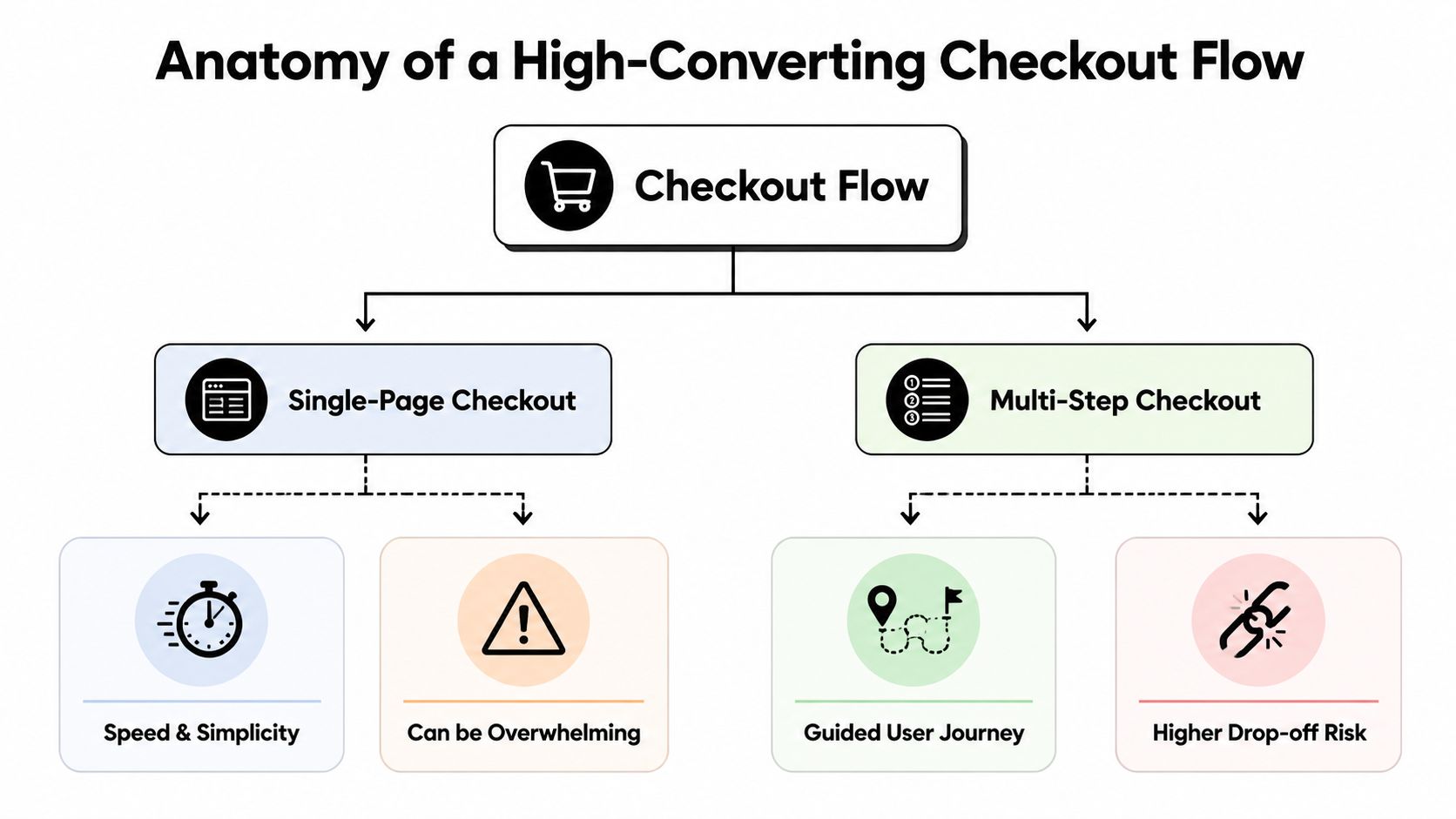
Single-page versus multi-step
There isn't one universally correct layout. The right structure depends on what you sell, how much information you need, and how much trust work the page must do.
| Flow type | Works well when | Main risk |
|---|---|---|
| Single-page checkout | The purchase is simple, the product is low-complexity, and the buyer can complete payment with minimal input | The page can feel dense if too many decisions appear at once |
| Multi-step checkout | You need to separate shipping, billing, review, and payment into manageable chunks | Each extra step creates another place to drop off |
Single-page works best when you can keep the interface calm. Multi-step works best when each stage has a clear purpose and the user can see progress. Problems start when teams pick a format for internal convenience rather than buyer clarity.
What should appear early
The opening part of the checkout flow should do the most important confidence work. That means the first screen or first visible block should include:
- Guest checkout first: Let account creation happen after payment or as an optional convenience.
- Order clarity: Product name, quantity, key terms, and total context should be visible without hunting.
- Payment expectation: If you accept multiple methods, show that early so buyers don't discover a mismatch late.
- Step visibility: Progress indicators help when the flow spans several screens.
A useful rule is to front-load certainty and delay complexity. Ask for the easiest information first. Save edge-case inputs until they're needed. If you support returning customers, give them a fast path. If you support impulse purchases, don't make the flow look like an application form.
For teams looking at payment speed as part of UX, this one-click payment article is worth reviewing because it highlights where reducing steps matters most.
Optimizing for Mobile Performance and Usability
Mobile checkout fails when it asks people to type, think, and wait on a small screen.
Campaign Creators reports that users are 164% more likely to convert on desktop than on mobile, as noted in their guide to ecommerce checkout page best practices. That gap isn't just about device preference. It reflects design debt. A desktop flow can survive clutter and still function. A mobile flow can't.
Mobile friction is usually input friction
On mobile, every unnecessary field costs more. Typing is slower, error recovery is more annoying, and visual scanning happens in shorter bursts. That's why strong mobile checkout page design cuts effort aggressively.
Use a narrow set of field rules:
- Prefer fewer fields: Combine where possible, and remove anything that doesn't directly support payment or fulfillment.
- Support auto-fill: Let the browser or device do as much work as possible.
- Use large tap targets: Buttons, radio choices, and dropdowns need enough space for thumbs.
- Format as users type: Card numbers, phone numbers, and dates should become readable automatically.
A lot of mobile problems are created by desktop-first forms that were made responsive. That's not enough. Responsive layout fixes width. It doesn't fix interaction cost.
If a form feels tolerable on mobile, it's usually still asking for too much.
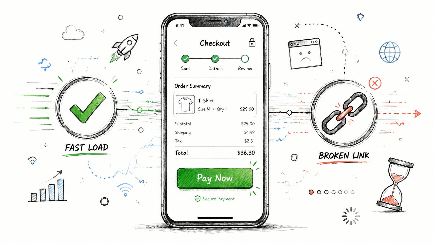
Speed is part of the interface
Mobile users notice loading lag immediately because they're often switching contexts, dealing with unstable connections, or checking out in short time windows. A checkout that loads slowly or refreshes awkwardly creates doubt, even if the form itself is well designed.
The practical fixes are familiar, but teams still skip them:
- Keep page weight light: Large images, unnecessary scripts, and bloated trackers compete with checkout performance.
- Avoid disruptive reloads: Inline validation is better than forcing the user through repeated form submissions.
- Preserve entered data: If the page errors or refreshes, don't make the user start over.
A quick visual explainer helps when aligning product, design, and engineering around this problem:
The mobile version of checkout should also simplify choice presentation. Long payment lists, dense coupon sections, and oversized legal copy bury the primary action. Put the critical path first. Make secondary actions, like promo entry or account creation, visually quieter.
Handling Global Payments and Building Trust
Most checkout advice stops at layout. That's a problem if you sell internationally.
A common weakness in checkout guidance is that it doesn't deal with cross-border payment reality. As discussed in Stripe's article on designing an ecommerce checkout page, many guides focus on page structure but not on how payment rails, currencies, and settlement complexity affect the buyer experience and merchant operations. For international businesses, that's often the harder part.
Payment choice is part of checkout UX
Customers don't separate payment availability from design quality. If the page looks clean but doesn't offer a familiar way to pay, the experience still fails.
That's why global checkout page design should answer three practical questions early:
| Question | Why it matters |
|---|---|
| Which payment methods will this customer trust immediately? | Familiarity lowers hesitation at the moment of commitment |
| How much complexity does method choice add to the page? | More options can help conversion, but too many can slow decision-making |
| What happens operationally after payment succeeds? | Settlement, reconciliation, refunds, and recurring billing all affect the business side |
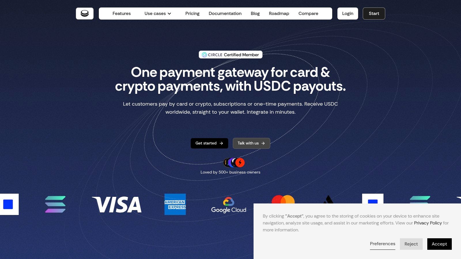
For companies selling across borders, accepting both card and crypto can remove a real purchase barrier. The key is to keep the front-end experience familiar while reducing back-end complexity. Suby is one option for this setup. It provides an API that lets businesses accept payments by card or crypto, while businesses receive USDC. It also offers native integrations with Discord and Telegram for subscriptions, paid access, and online communities.
That model changes the design conversation. You're no longer choosing only where the card form sits on the page. You're deciding how to present payment choice without making checkout feel risky or fragmented.
The checkout should feel local to the buyer and operationally predictable to the business.
Trust signals that reduce hesitation
Trust isn't built by adding random badges to the footer. It comes from clear answers to the questions buyers have right before payment.
The essentials are usually these:
- Visible security context: Explain payment protection in plain language and show the secure nature of the transaction without clutter.
- Clear refund policy: If refunds are possible, say how they work before payment, not after a support ticket.
- Straight billing language: For subscriptions, state renewal behavior and access terms in simple text near the action button.
- Recognizable payment marks: Showing supported card brands and accepted crypto assets can reduce uncertainty when done cleanly.
- Accessible support path: A buyer who can't find help won't always ask. They often just leave.
Design teams often over-invest in decorative reassurance and under-invest in operational clarity. The second one matters more. International buyers especially want to know whether the payment will go through cleanly, whether the charge is understandable, and what happens if something needs to be reversed or updated later.
Beyond Conversion A/B Testing and Lifecycle KPIs
A checkout can look efficient and still hurt the business if it only optimizes the first payment.
That blind spot shows up in a lot of advice. Most checkout guides focus on the initial purchase and give very little attention to failed renewals, access restoration, refunds, or recurring payment management, as noted in Uptop's checkout page design discussion. For subscription businesses, SaaS products, and paid communities, that's not a side issue. It's a core part of the customer experience.
Test the moments that create doubt
A/B testing checkout isn't about changing button colors at random. The useful tests target uncertainty.
Start with decision points that affect intent:
- Guest versus account-first entry: See whether optional account creation after purchase reduces drop-off.
- Button copy: Test whether the final action should emphasize payment, access, or plan start.
- Field labels and helper text: Small wording changes can clarify what's required and why.
- Billing explanation placement: Recurring terms often work better near the CTA than hidden below it.
The best tests don't chase novelty. They remove hesitation. If a user pauses, re-reads, or backtracks, there's probably something unclear enough to test.
Field note: When checkout performance stalls, the answer is often clearer wording, not more persuasion.
Retention starts on the checkout page
Recurring revenue businesses need a broader scorecard than conversion rate alone. A checkout that drives signups but creates billing confusion can increase support load, failed payments, and churn later.
That's why lifecycle KPIs matter alongside front-end conversion. In practice, teams should watch:
- Renewal continuity: Are subscribers staying active without billing interruptions?
- Failed payment recovery: Does the system prompt users clearly when a renewal doesn't go through?
- Access state accuracy: If payment fails, is product or community access updated correctly and reversibly?
- Refund handling quality: Are expectations and support paths clear enough to prevent avoidable disputes?
This matters even more for paid access products, memberships, and communities. If someone joins a Discord or Telegram group through a subscription flow, checkout design should set expectations about recurring billing, cancellation, and what happens when payment fails. That's not just policy language. It's retention UX.
A strong payment flow doesn't end at authorization. It carries through retries, status updates, customer messaging, and access logic after the transaction.
Implementation Checklist for Your Development Team
Good checkout page design usually breaks in implementation, not strategy. The handoff has to be precise.
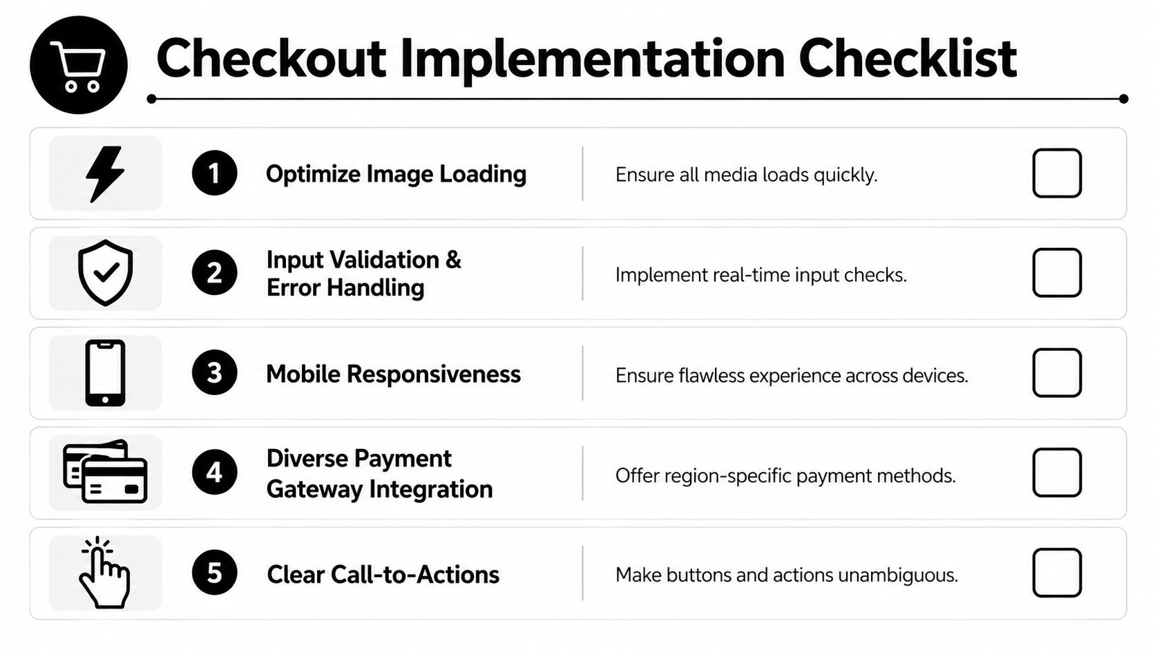
Core build requirements
Give your development team a checklist that reflects actual buyer friction:
- Map required fields only: Separate required, optional, and conditional fields before anyone starts building forms.
- Add real-time validation: Show errors next to the relevant input, in plain language, before final submission.
- Preserve state: If a payment attempt fails or the user returns to a previous step, keep their progress intact.
- Design mobile-first interactions: Tap size, keyboard behavior, spacing, and auto-fill support should be specified, not implied.
- Keep payment options structured: Present methods in a clear order based on customer fit, not internal preference.
For API-led teams, implementation details matter as much as layout. Product managers should align with engineering on hosted checkout versus embedded flow, event handling, retry logic, and edge cases around interrupted payments. This payment gateway API integration guide is useful background when framing those requirements.
Operational requirements after payment
The development brief should also include what happens after the button click. That's where many checkout projects become incomplete.
Make sure the build covers:
- Webhook handling for payment outcomes: Successful, pending, failed, refunded, and subscription-related events should trigger the right business logic.
- Confirmation states: Show clear post-payment messaging so customers know whether access is active, pending, or needs attention.
- Subscription lifecycle actions: Failed renewals, plan changes, cancellations, and access restoration need defined behavior.
- Security and accessibility basics: Use secure form handling, clear focus states, readable errors, and keyboard-friendly interactions.
- Support visibility: Include a path to help on checkout and in post-payment communication.
A clean checkout isn't just a page. It's a coordinated system between interface, payment logic, lifecycle handling, and customer communication.
If you need a payment layer for global checkout flows, Suby provides an API for accepting card and crypto payments while businesses receive USDC. It also includes native Discord and Telegram integrations for subscriptions, paid access, and online communities.