

Gaspard LEZIN
Check Out Buttons: High-Converting Checkout Buttons
Check out buttons - Master high-converting checkout buttons with our step-by-step guide. Learn design, A/B testing, and implementation with paylinks/APIs
You're probably looking at a checkout flow that mostly works, yet still leaks revenue in the last few seconds before purchase. The product page is fine. Traffic is fine. Intent is there. Then customers hit the final button, hesitate, second-guess what happens next, or get dragged through a payment flow that feels longer than it should.
That's why check out buttons deserve more attention than they usually get. They aren't just UI elements. They're the point where copy, trust, payment method choice, implementation quality, and settlement logic all meet. A good one reduces uncertainty. A bad one makes buyers pause right when you need momentum.
For teams selling across borders, the button matters even more. The customer might want to pay by card, wallet, bank, or crypto. The business might want settlement to a bank account or in stablecoins like USDC. Those choices should feel invisible to the buyer and manageable for the operator. That's the bar.
Table of Contents
Why Your Checkout Button Is Costing You Sales
Clarity beats cleverness
Size, placement, and visual weight
Trust signals that help, not clutter
When a paylink is enough
When embedded checkout makes sense
When you need direct API control
What the integration actually needs
Where settlement flexibility changes the design
The four ways to use the same product
Test the decision point, not random cosmetics
What to watch after launch
Accessibility rules worth enforcing
Technical issues that break checkout buttons
Why Your Checkout Button Is Costing You Sales
The pattern is familiar. A shopper adds to cart, reviews the total, reaches checkout, then hits a wall that feels small from the merchant side and annoying from the customer side. Extra fields. A vague button label. A payment choice that only appears too late. A redirect that feels risky.
That last button often gets treated like a styling task, but it's really a conversion surface. Slow and complicated checkout processes have pushed at least one-third of consumers to abandon online purchases within the past 12 months, and buy buttons can help remove that friction by letting customers move faster through checkout, according to the checkout battle analysis. When the action is obvious and the path is short, people complete the purchase they already intended to make.
A lot of teams fix the wrong thing first. They redesign the cart, rework product pages, or chase headline copy changes while the final action remains vague. If you want a practical overview of where Shopify stores usually lose momentum in this stage, Grumspot's Shopify checkout insights are a useful companion read because they focus on the messy details that show up in real stores.
Practical rule: If the customer has to stop and interpret your button, your checkout is already slower than it looks in analytics.
The fix usually isn't dramatic. It's making the action specific, reducing steps, showing accepted payment options early, and removing the mismatch between how customers want to pay and how your business wants to get paid. That's also where modern checkout design earns its keep. If you want a grounded look at the broader UX side, this guide to checkout page design principles is worth reviewing before you touch code.
The Anatomy of a High-Converting Checkout Button
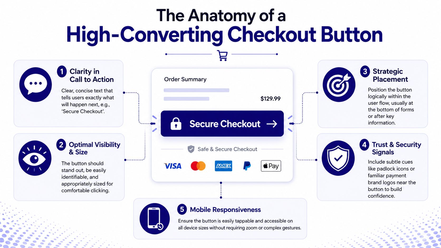
A high-converting button does two things at once. It gets noticed, and it removes doubt. Often, the focus is on the first part, leading to underinvestment in the second.
Clarity beats cleverness
Button copy should describe the result, not the interface step. “Submit” and “Next” are weak because they force the customer to infer the consequence. 65% of leading e-commerce sites perform “mediocre” or worse in Checkout UX due to generic verbs like “Submit” or “Next” that fail to communicate the action's consequence, while naming conventions like “Place Order” reduce friction, as noted in this checkout UX write-up.
Use labels that answer the buyer's immediate question.
For final purchase steps: “Place Order” or “Complete Purchase”
For payment-first flows: “Pay Now”
For multi-step forms: “Continue to Payment”
For accelerated flows: “Secure Checkout”
Avoid cute language. It usually tests worse because it adds interpretation work. If you need examples outside checkout, these call to action strategies are a decent reference for how wording changes intent without adding friction.
The button text should tell the customer what happens next without needing surrounding copy to explain it.
Size, placement, and visual weight
Design teams still underestimate how much physical dimensions affect interaction. The button has to look tappable, intentional, and important. If it blends into secondary actions, customers hesitate. If it looks oversized without context, it can feel aggressive or unsafe.
A practical baseline is this:
Element | What works | What fails |
|---|---|---|
Size | Comfortable tap target, visually primary | Thin buttons, tiny height, cramped mobile targets |
Placement | Close to totals, shipping summary, or final form fields | Floating far below the fold or buried among utility links |
Contrast | Strong contrast with surrounding UI | Low-contrast brand colors that disappear into the page |
Spacing | Enough whitespace to isolate the primary action | Dense layouts that merge the CTA into form clutter |
For payment-specific buttons, expert benchmarks show payment button heights must range between 40px and 55px, with 48px as the default standard, and major deviations can increase drop-off, according to the payment button size guidance. In practice, that means you shouldn't compress a checkout button just to make the page feel cleaner.
Trust signals that help, not clutter
Trust signals work best when they stay close to the action and don't compete with it. A lock icon, familiar wallet mark, card brand row, or short security note can reduce uncertainty. A crowded badge farm usually does the opposite.
Keep the supporting signals compact:
Payment familiarity: Show the methods the buyer can use on this page
Security context: A short note is enough if the rest of the checkout already feels professional
Cross-border confidence: Make settlement and currency logic invisible to the buyer unless they need to choose
The biggest mistake here is overexplaining. Buyers don't need a lecture about payments at the point of conversion. They need a button that looks trustworthy, says exactly what it does, and sits where they expect it.
Choosing Your Implementation Method
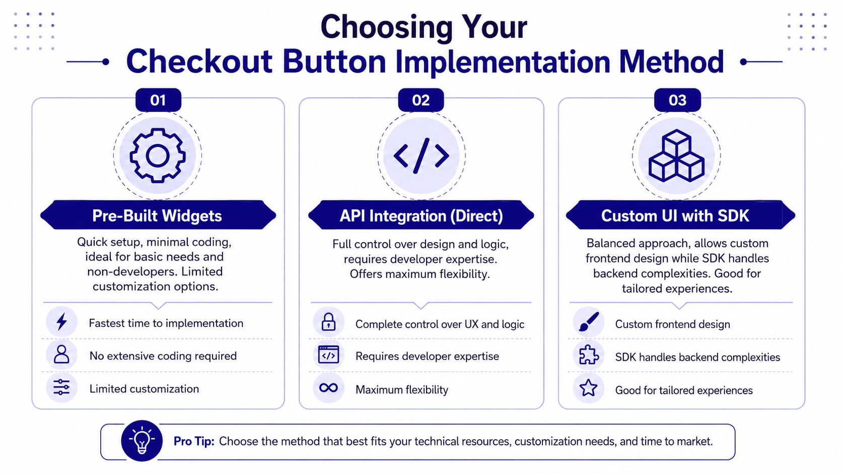
There isn't one right way to add check out buttons. The right choice depends on who owns the flow, how much control you need, and how quickly you need to ship. Implementations often fall into one of three buckets: paylinks, embedded checkout, or direct API.
When a paylink is enough
Paylinks are the fastest option when you don't need a highly custom frontend. They work well for invoices, creator products, one-off sales, community access, support retainers, and social commerce.
The trade-off is control. You usually won't shape every detail of the page state or stitch the payment moment into your product UI as tightly as you could with an embed or API. But for lean teams, speed matters more than perfect control.
A paylink setup is often the right choice if:
You sell through multiple channels: email, chat, DMs, and invoices
Your team is small: design and engineering time is limited
You need a usable payment surface quickly: especially for one-time offers or manual billing
When embedded checkout makes sense
Embedded checkout is the middle path. You keep the customer inside your product or storefront, but you avoid building every payment state from scratch. For a lot of businesses, this is the most sensible balance.
The upside is consistency. The buyer stays in your environment, the flow feels native enough, and your team avoids owning every low-level payment interaction. The downside is that you still work within the boundaries of the embed model. If you want very specific interaction patterns, you may hit those limits.
A practical comparison looks like this:
Method | Best for | Main trade-off |
|---|---|---|
Paylink | Fast launches, invoices, creator sales | Less control over surrounding UX |
Embed | Product pages, carts, SaaS billing screens | Some customization limits |
API | Full checkout ownership | More engineering and QA burden |
If your focus is speed with fewer clicks, this article on one-click payment patterns is a useful reference point for deciding whether an embedded approach is enough or whether you need deeper integration.
When you need direct API control
Direct API integration is for teams that want checkout to behave like part of the product, not an attached payment layer. You choose the state transitions, the validation behavior, the analytics events, the fallback logic, and how payment options appear by market, segment, or cart state.
That control is valuable, but it comes with real responsibilities.
Engineering ownership: Your team handles more implementation detail and testing.
QA complexity: More permutations means more edge cases across devices, currencies, and payment methods.
Long-term flexibility: You can tailor flows for subscriptions, gated access, invoices, or hybrid card and crypto paths, including distinct buttons for each of your subscription tiers.
Build custom only when you're prepared to maintain custom. A checkout flow is never finished after launch.
For many fast-growing teams, the right answer isn't philosophical. It's operational. Start with the least complex method that still supports your payment mix and reporting needs. Move deeper only when the constraints become real.
A Practical Guide to Integrating Buttons with Suby
When teams ask for a practical setup, what they usually want is simple. One checkout. Card and crypto acceptance in the same flow. Enough flexibility to fit their product. Settlement options that don't force the business into the same preference as the customer.
Suby is an API that lets businesses accept payments by card or crypto, and it also offers native integrations with Discord and Telegram for use cases like subscriptions, paid access, and online communities. It's a single product with four ways to use it: Suby Payments, Suby Crypto, Suby Gating, and Suby Invoicing. In practical terms, customers can pay by card, wallet, bank, or crypto, and the business can choose to receive funds to a bank account or in stablecoins like USDC. Pricing depends on the payment method used, so it's worth checking the payment gateway API integration overview and the pricing page before implementation decisions are locked in.
What the integration actually needs
If you've integrated pre-styled checkout components before, the pattern is familiar. You define a render target, set configuration, and trigger rendering. The shape is straightforward, even if the exact component names differ by provider.
A clean button implementation typically follows three stages, similar to the pre-styled pattern described in the checkout button implementation guide:
Add a container element where the button should render.
Pass configuration attributes such as page type or style options.
Invoke the render function so matching containers populate automatically.
That last part matters more than many teams think. Auto-rendering reduces hand-written DOM work, which usually means fewer rollout bugs when the button appears in more than one place.
Where settlement flexibility changes the design
Most checkout button discussions stop at acceptance. That's only half the job. For international businesses, settlement logic affects product decisions, pricing operations, treasury workflows, and internal reporting.
A useful example is the card-to-USDC flow. The customer pays with a card because that's what they prefer. The business receives USDC because that's how it wants to manage cash or pay suppliers. That's not the only flow, but it shows why flexible settlement matters. You don't have to force the customer into your internal payout preference.
This matters in four common operating models:
Global SaaS: customers pay with mainstream methods, finance prefers stablecoin settlement
Agencies and freelancers: clients choose familiar payment methods, operators receive funds in the currency they use
Communities and creators: access sales happen through links, embeds, or chat-native flows
Crypto-native products: buyers may use cards or crypto, while the business chooses payout destination later
The four ways to use the same product
The product model is simpler when you keep it unified.
Use case | What it does |
|---|---|
Suby Payments | API-first payment stack for accepting card, bank transfer, Apple Pay, Google Pay, Klarna, and more, and crypto through one checkout |
Suby Crypto | Crypto payment gateway that handles the swap, sponsors the gas, and settles to a self-custody wallet or a unified Suby balance, keeping the same assets the customer paid or auto-converting to USDC on Base |
Suby Gating | Paid access for Discord, Telegram, downloads, and courses |
Suby Invoicing | Lets the client pay how they want while the business receives what it wants |
The official API docs state that Suby Payments is an API-first stack that enables merchants to accept card, bank transfer, Apple Pay, Google Pay, Klarna, and more, and crypto payments, including USDC, through a single unified checkout, with launch capability in as few as five lines of code in the Suby API introduction.
A checkout button should hide payment complexity from the buyer, not hide implementation complexity from your team. If the integration is fragile, the UX eventually becomes fragile too.
How to A/B Test and Analyze Button Performance
A checkout button shouldn't be treated as finished because it shipped. The first version only tells you what was good enough to launch. It doesn't tell you what was best for your buyers.
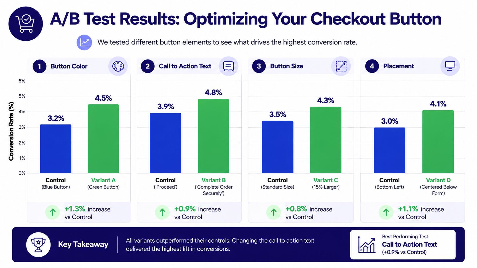
Start with the asset below as a visual reference for common test patterns, then use your own environment to validate what changes behavior.
Test the decision point, not random cosmetics
Many A/B programs fail because the team tests easy variables instead of meaningful ones. If the change doesn't alter certainty, visibility, or effort, it probably won't teach you much.
Good button tests usually sit in one of these buckets:
Copy tests: “Continue” versus “Continue to Payment,” or “Pay Now” versus “Complete Purchase”
Placement tests: below the order summary, fixed on mobile, or repeated after key sections
Hierarchy tests: whether wallet buttons appear before or after the main checkout button
Flow tests: direct checkout versus cart-first routing
The point isn't to run many tests. The point is to isolate one reason a customer might pause.
A practical testing discipline looks like this:
What to test | Why it matters |
|---|---|
Button copy | Removes ambiguity about outcome |
Primary color and contrast | Affects discoverability and tap confidence |
Button size on mobile | Changes ease of interaction |
Position relative to totals | Helps buyers act when intent peaks |
Video examples can help teams align on what to evaluate in live flows, especially when product, design, and engineering look at the same problem differently.
What to watch after launch
Button clicks alone aren't enough. A visually stronger button can increase clicks and still reduce completed orders if it sends low-intent users into a poor next step.
Track the sequence, not the isolated event:
View-to-click rate on the primary checkout action
Checkout initiation rate after the click
Payment completion rate after method selection
Drop-off by payment type if you offer multiple paths
Error and retry patterns around the button and modal states
I also prefer to review session recordings for failed checkouts after every meaningful test. Quant data tells you where the friction is. Watching a few real sessions often tells you why.
Watch for this pattern: A variant can lift button clicks while hurting completed payments if the copy overpromises or sends users into a clumsy next step.
Ensuring Accessibility and Troubleshooting Common Issues
A buyer reaches the final step, taps the checkout button, and nothing happens. On desktop, the flow passed QA. On a real phone, inside a crowded theme with third-party scripts, the button sits under an overlay and the tap never lands. That is not a design issue or an engineering issue in isolation. It is a revenue issue.
Accessibility work and troubleshooting discipline solve the same business problem. They reduce the number of buyers who want to pay but get blocked before money settles.
Accessibility rules worth enforcing
The standard is simple. Every buyer needs a clear path to complete payment whether they arrive with a mouse, keyboard, screen reader, mobile device, or assistive tech.
Start with the parts that break most often in production:
Visible focus states: keyboard users need to see exactly where they are before they confirm payment
Specific button text: labels like “Complete Purchase” or “Pay Now” set the right expectation better than vague copy
Readable contrast: branded buttons still need text and borders that remain legible in low-light and low-vision conditions
Useful accessible names: if the visible label is short, the ARIA label should add context, not repeat noise
Predictable state changes: loading, disabled, success, and error states should be announced clearly and rendered consistently
Screen reader support matters here too. The W3C guidance on button accessibility is a good reference for keyboard behavior, labels, and state changes that users can understand. In payment flows, small implementation mistakes create outsized friction because the user is already making a trust decision.
Technical issues that break checkout buttons
The failures are usually mundane. Race conditions, stale totals, conflicting event listeners, blocked scripts, and bad assumptions about cart state cause more button problems than visual design does.
A practical checklist catches most of them:
Button does not render: confirm the mount target exists before your paylink, embed, or API-driven component initializes
Amount is wrong: make sure cart totals, taxes, discounts, and currency come from the same source of truth
Click does nothing: inspect overlays, z-index conflicts, disabled states, and click handlers attached by theme or app code
Modal or redirect fails: verify required scripts load in the right order and are not blocked by consent tools or CSP rules
Only one payment path fails: compare method-specific config for card, wallet, bank, or crypto instead of assuming the shared wrapper is the problem
Errors appear only on mobile: test tap targets, viewport resizing, and autofill behavior on actual devices, not just responsive mode
Implementation choice matters. A hosted paylink reduces surface area and usually removes front-end conflicts. An embed gives more control but inherits the quirks of your site. A direct API build gives the most flexibility, but your team owns more edge cases around state, retries, and fallback behavior.
That trade-off gets sharper when you support multiple settlement options. If customers can pay in fiat or crypto while the business chooses how funds settle, the button logic has to stay clear even as the payment paths diverge underneath. Suby is useful here because the same platform can support paylinks, embeds, and API-based flows while letting merchants accept card or crypto and settle in the format that fits their operation.
Test like a customer, not like a developer. Run the flow on real devices, weaker networks, guest checkout, logged-in sessions, discounted carts, expired sessions, and cross-border orders. The bugs that hurt conversion rarely show up in the happy path.
If you're rebuilding check out buttons for a global customer base, Suby is worth evaluating. Suby is a payment gateway and Merchant of Record: your customers pay with card, bank transfer, Apple Pay, Google Pay, Klarna, and more, or stablecoins, and you get paid out to your bank account, or directly in stablecoins (USDC, EURC) to your wallet. Anywhere in the world, no bank account required. That way a single checkout button can accept every payment method your buyers expect, while you settle in the format that fits your operation.
